

Home & Away
As strategic brand advisors, it’s our job to keep our clients ahead of the game.
A core part of our role at the Premier League is to ensure they keep their brand moving forward - continually innovating and evolving.
The vibrant new visual identity was one of the stand-out successes of the 2016 rebrand. Two years on, and with a new commercial cycle due to begin, the time was right to conduct a ‘brand check-up’ and to ensure the identity was fit-for-purpose; modern, digital first and partner-friendly.
Customer insights
Working closely with Nomad Studio, we assembled a comprehensive visual audit of the brand. In addition, we spoke with commercial partners and broadcasters to understand how the identity could be evolved to meet their needs.
Competitor benchmarks
In parallel, we benchmarked the identity with other leading sports and brands to evaluate how well it was performing, and if anything needed to change for it to remain distinctive, modern and vibrant.
Brand analysis
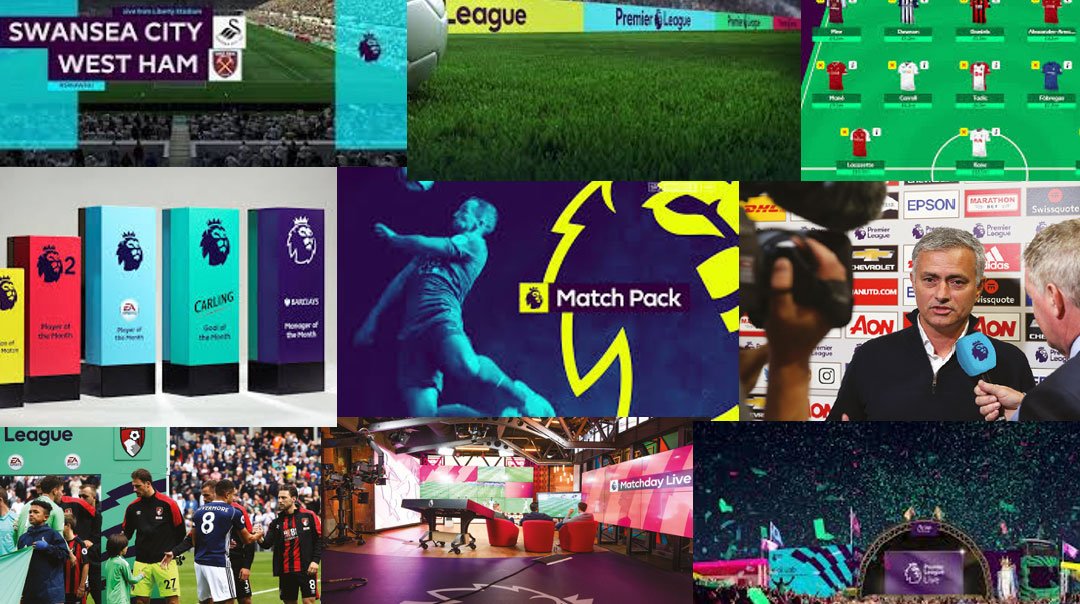
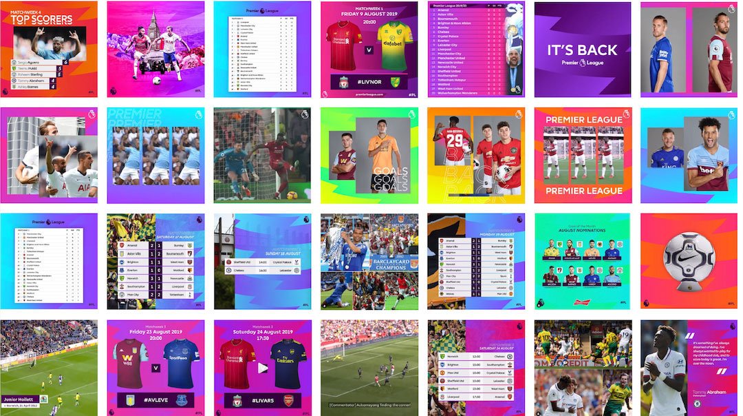
We structured our findings around the familiar football construct of ‘Home and Away’. Home looked at the brand’s performance within Premier League channels, and Away looked at third party channels.

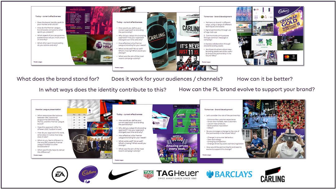
This simple approach highlighted a gap in visual consistency and brand impact – it looked colourful and vibrant at Home but recessive and sterile Away.
The core components of the identity (logo, colours, font) would remain relatively unchanged but further creative development was required to make the identity simpler to use, more distinctive (as other brands had adopted similar techniques), and more consistent across all channels.

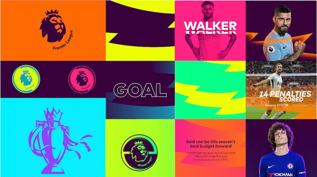
More vibrant, more visible
Nomad took the lead through the next stage, although we remained closely involved, providing input to the creative development and attending reviews and presentations to ensure the strategic recommendations remained to the fore.
The evolved identity resulted in two key outcomes:
1. More colours to further enhance the recognisable vibrancy of the brand
2. More assets to help partners and broadcasters increase consistency.
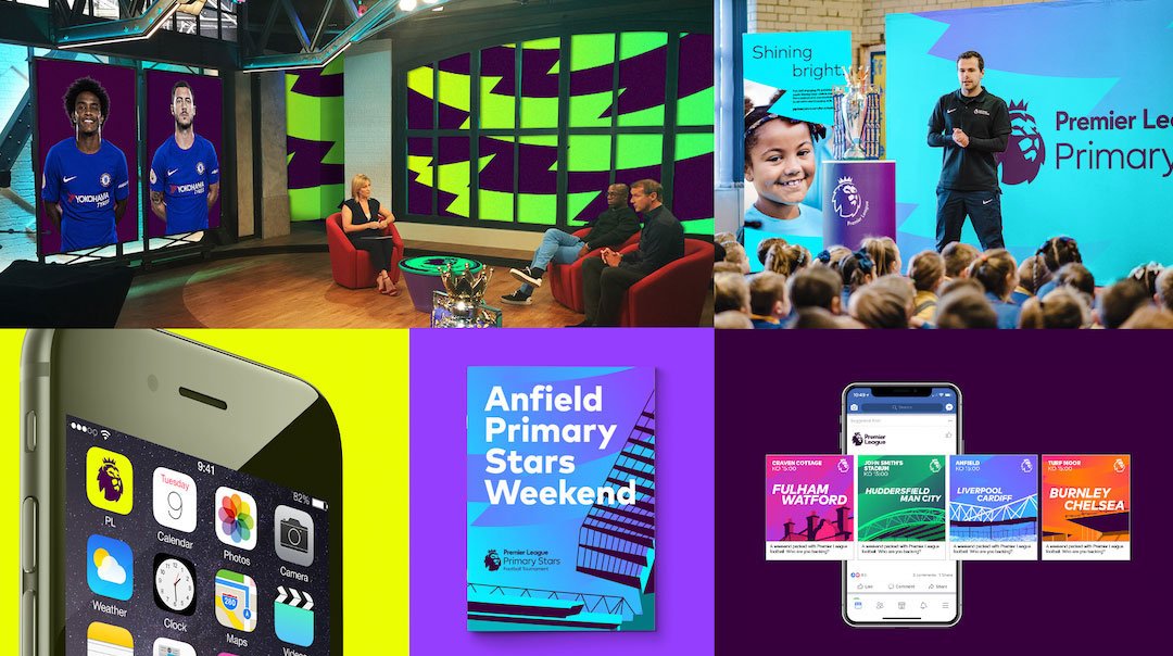
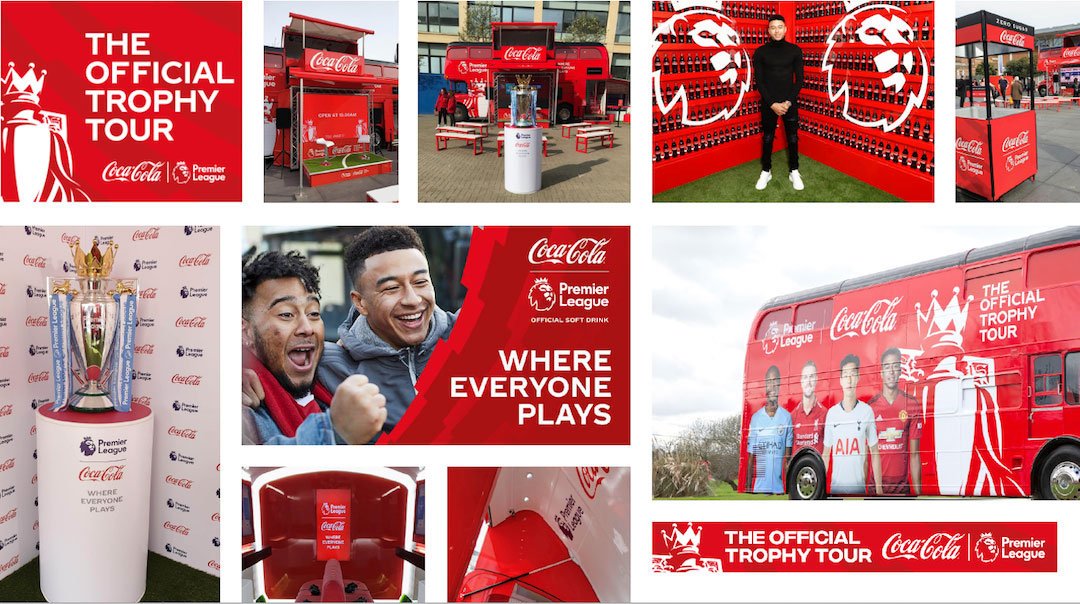
New assets were created, including a ‘Partner Badge’ to more powerfully signal each partnership, and a unique illustration of the Premier League trophy. The designs used the vibrant colour palette to increase brand visibility and recognition within partner and broadcast channels.
Throughout the development phase, we returned to consult with partners and broadcasters to check our new thinking was in-line with their needs.Brand analysis
We structured our findings around the familiar football construct of ‘Home and Away’. Home looked at the brand’s performance within Premier League channels, and Away looked at third party channels.
The refreshed identity and new assets were introduced to Premier League, partner and broadcast channels from the start of the 2019/20 season.


During the autumn of 2019 we conducted a follow-up review to see how the new assets were working in practice.
We were extremely pleased with the early results, showing a high adoption, and a more visibly vibrant and confident brand, both Home and Away.
We are incredibly proud of our work with the Premier League and the strength of our relationship. Now in our ninth year, we continue to be excited by the brand and the potential of what is still to come.
You might also like

How we used brand strategy to change perceptions of the Premier League.

How do you find the right creative partner?
How we helped the Super League create a compelling proposition for a new generation of fans